
ABOUT
The Project
It is a Google Venture Sprint project which solves the problem of a native mobile app - Savr Recipes. It is a native mobile app that features crowd-rated recipes and cooking tips. Despite its popularity, users have recently reported dissatisfaction due to unclear instructions and confusing cooking steps, resulting in failed dishes and negative reviews.
Constraints
● Savr Recipes has an established logo and branding color etc.
● Logging in and Signing Up has been very effective.
● Finding Recipes easily is known as its strength.
● Time constraints for Google Venture Sprint - 5 days.
Roles and Responsibilities
● Research Synthesis
● User Maps
● Lightening Demos
● Crazy 8s
● Storyboard
● Hi-fi Screens
● Usability Testing etc.
Tools Used
Figma, FigJam, Emails,
Slack, Google Docs,
Google Drive &
Accessibility Checker etc.
Problem
● Timing of steps within a recipe.
● Order of steps not being clearly defined, or in an inefficient order.
● The need to learn new techniques that may not be outlined within a recipe.
Opportunities
Users struggled with unclear instructions and missing prep details on the Savr Recipes app. Our solution introduced an ingredients overview screen, photo-enhanced step-by-step guides, and voice commands for hands-free usability.
The Sprint Process
As I was the sole designer, I followed the slightly modified GV Sprint process for the project. The major activities during each day of the sprint are as follows:
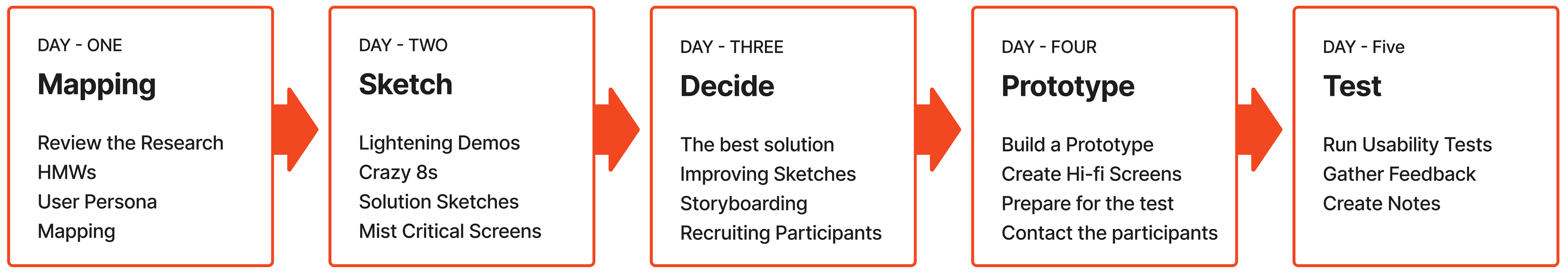
DAY ONE
Highlights
● Analyzed users versions aligning with the problem statements.
● User Persona depiction
● User Interview and synthesis
● Created User Journey Maps and Refined it.
Research Analysis
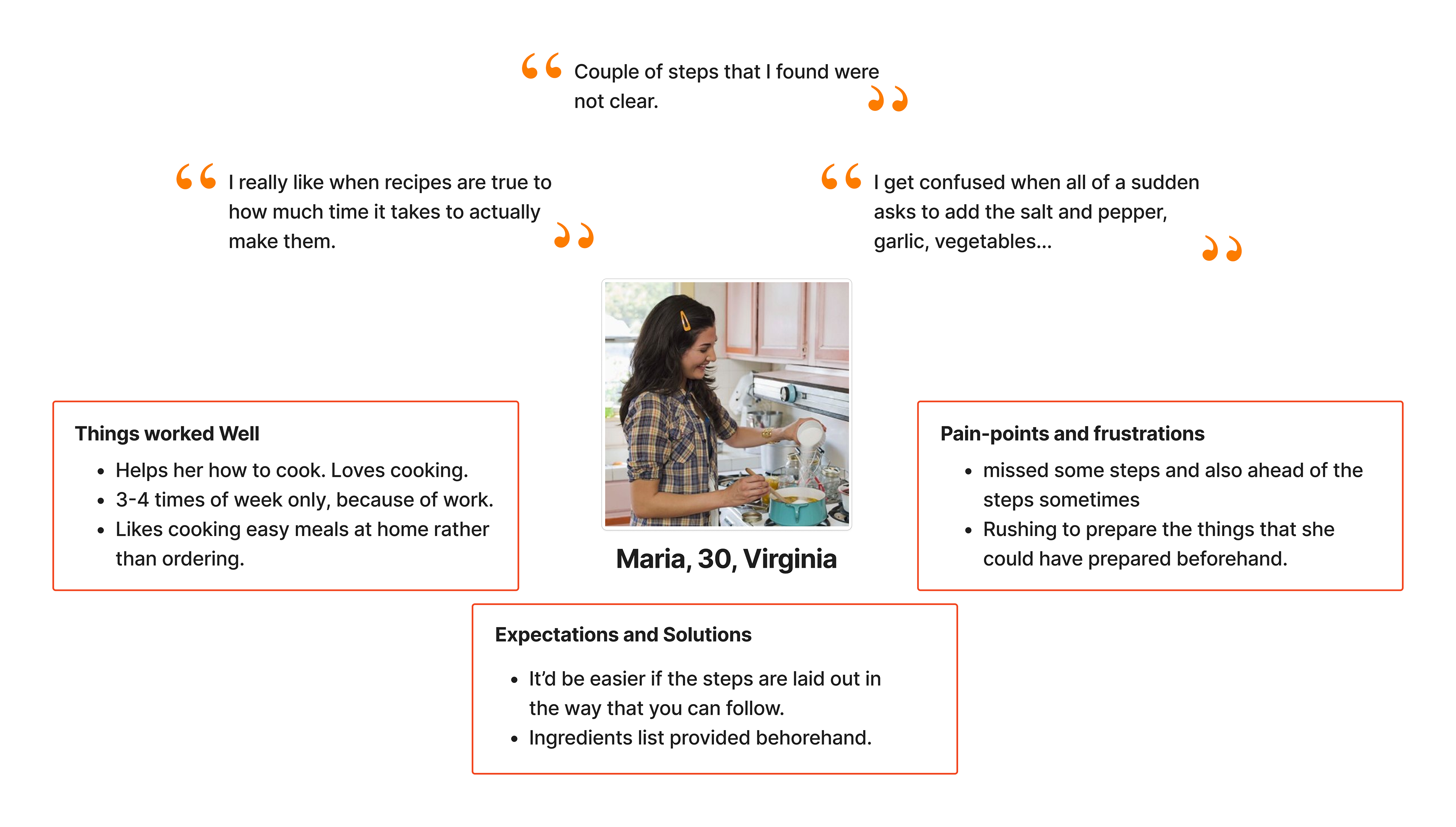
Savr Recipes shared user review quotes revealing key pain points and expectations. I analyzed this feedback to identify recurring issues and synthesized the findings to guide design improvements aligned with user needs.
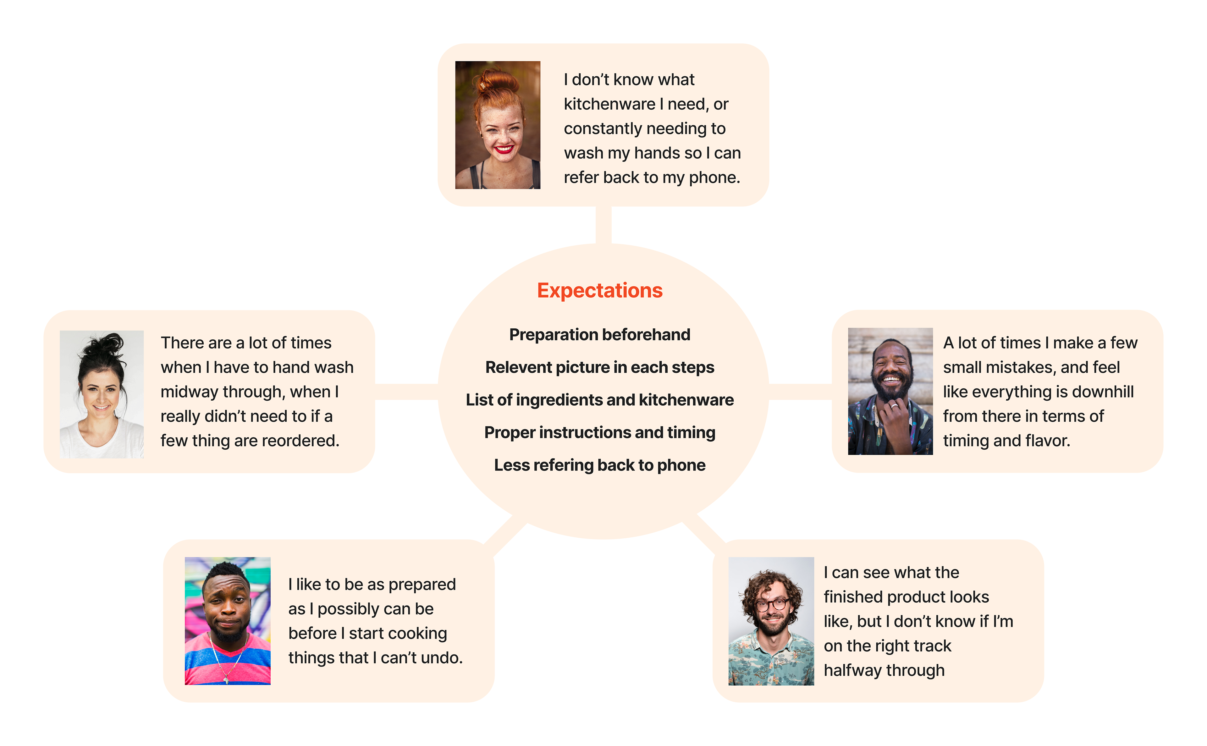
Concluding User Needs
● Preparation beforehand
● Relevant picture in each steps
● List of ingredients and kitchenware
● Proper instructions and timing
● Less referring back to phone
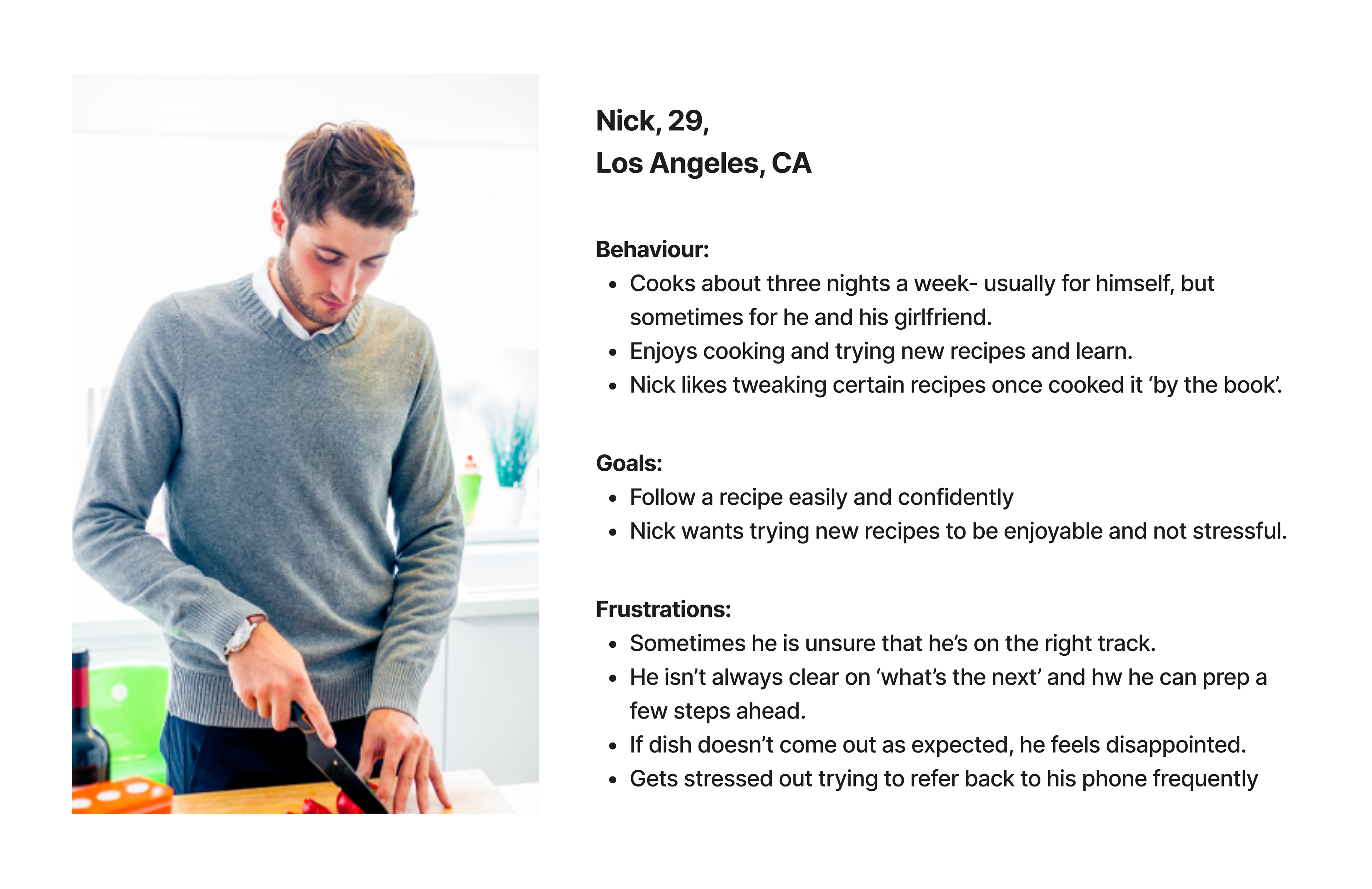
User Persona
I was provided with the details about a persona by Joe, the lead researcher from bitesizeux.com. The persona info was in elaborated form and I myself visualized the details with a few important categories for better understanding of the problem.
User Interview
After reviewing the videos and research provided, I was better able to understand the user pain points which gave me some insights on how to approach and solve this design challenge.
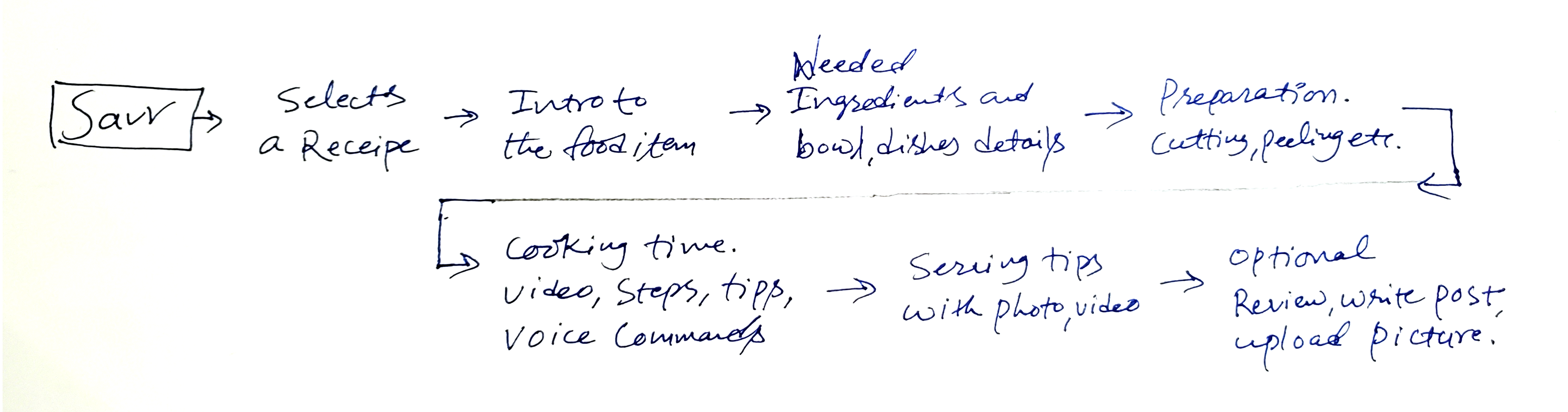
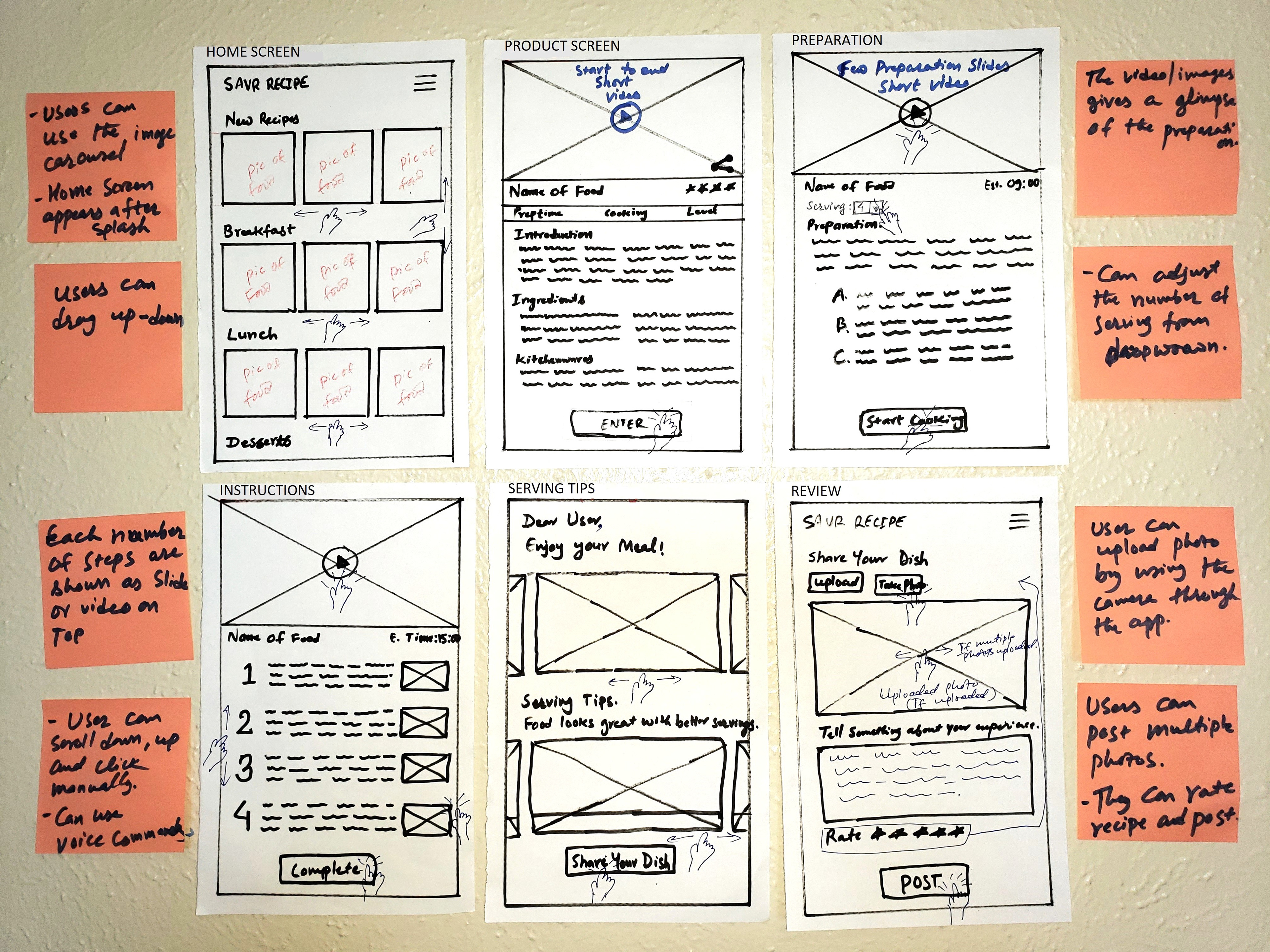
Initial User Journey Map
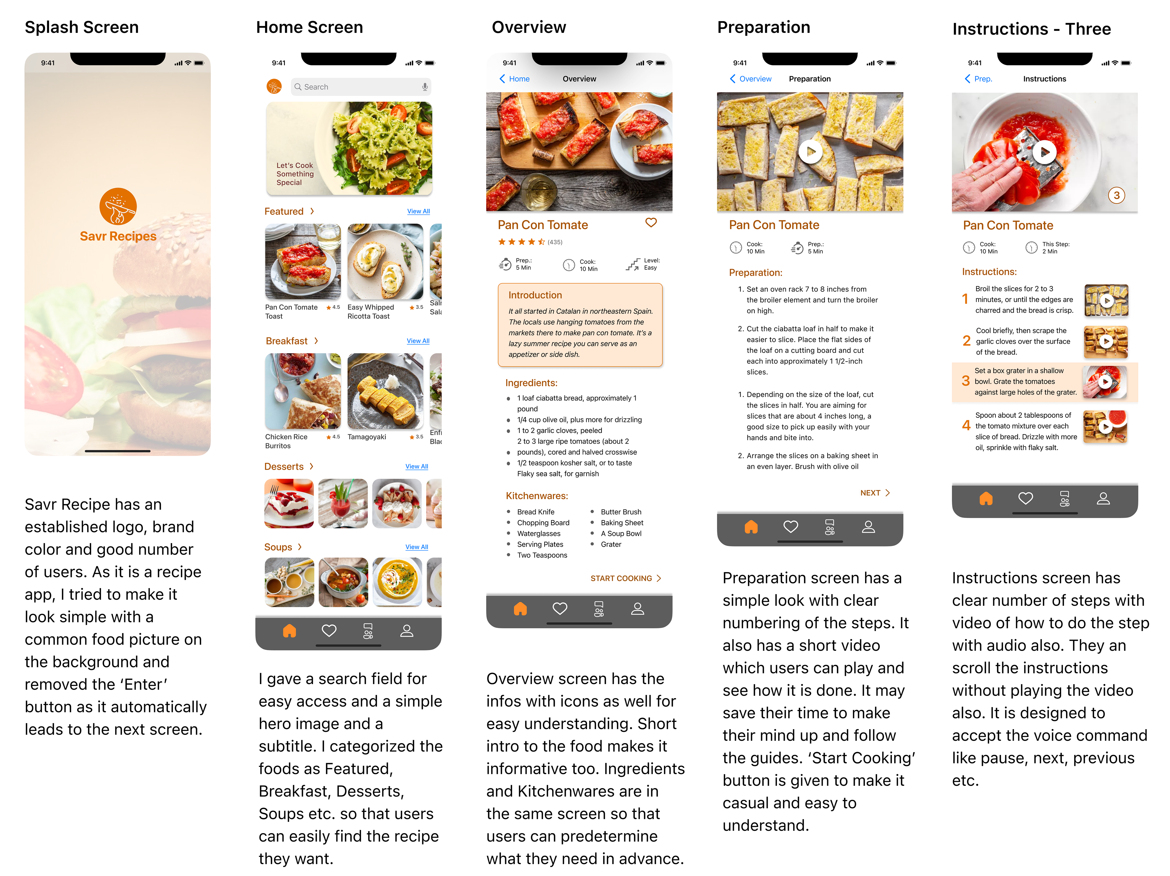
The journey map was ideated to provide separate screens for each major topics eg. Introduction, Ingredients & Kitchenwares, Preparation, Cooking, Serving and Review.
Refined and Elaborated User Journey Map
The initial user flow separated Overview and Ingredients screens. Through refinement, I combined ingredients and kitchenware on a single screen to reduce friction, support serving-based adjustments, and improve decision-making based on available items—ultimately creating a smoother, more intuitive experience.
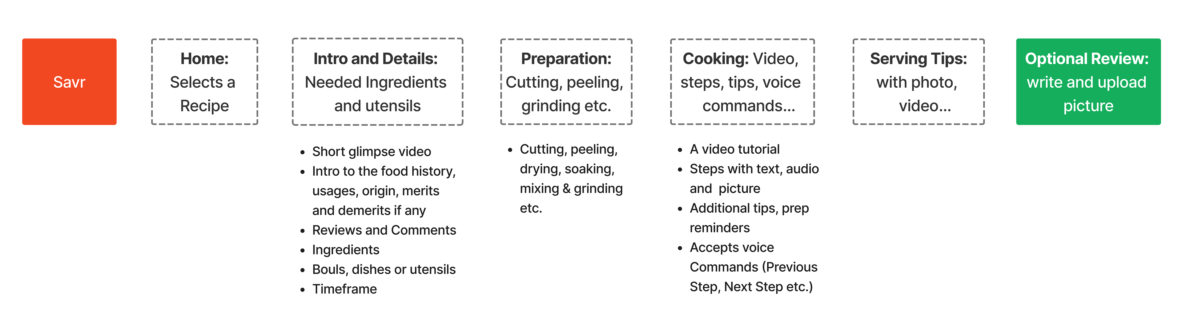
Users can also drag to the bottom of the page for the user reviews. It also consists of the bowls, dishes or any other utensils needed for the cooking process.
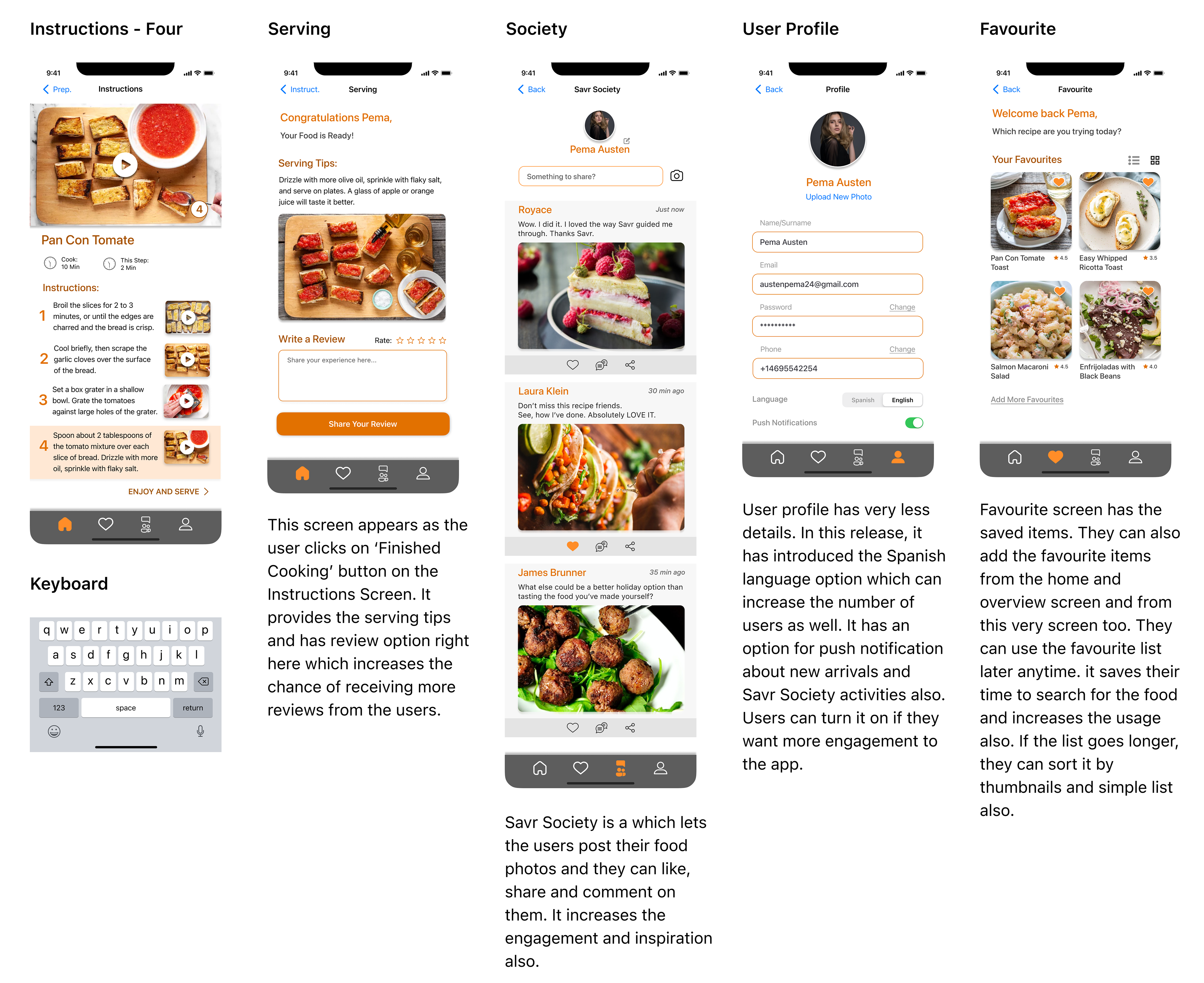
Preparation screen guides thoroughly with the tutorial photo or video. The Instructions screen has a detailed tutorial video. It will give additional tips and preparation reminders if the cooking process is long and vast.
It also accepts voice commands. And after the cooking is finished, users can get some tips regarding the serving and they can post their reviews optionally.
DAY two
Highlights
● Competitive Research and Lightning Demos
● Evaluated the strengths and weaknesses of the competitors for takeaways.
● Crazy 8s
● Selected and refined Most Critical Screens
Lightening Demos:
Competitive Research
For the reference of how other apps are offering the solution of such problems, I googled three websites from the same genre and collected some of their strengths and weaknesses.
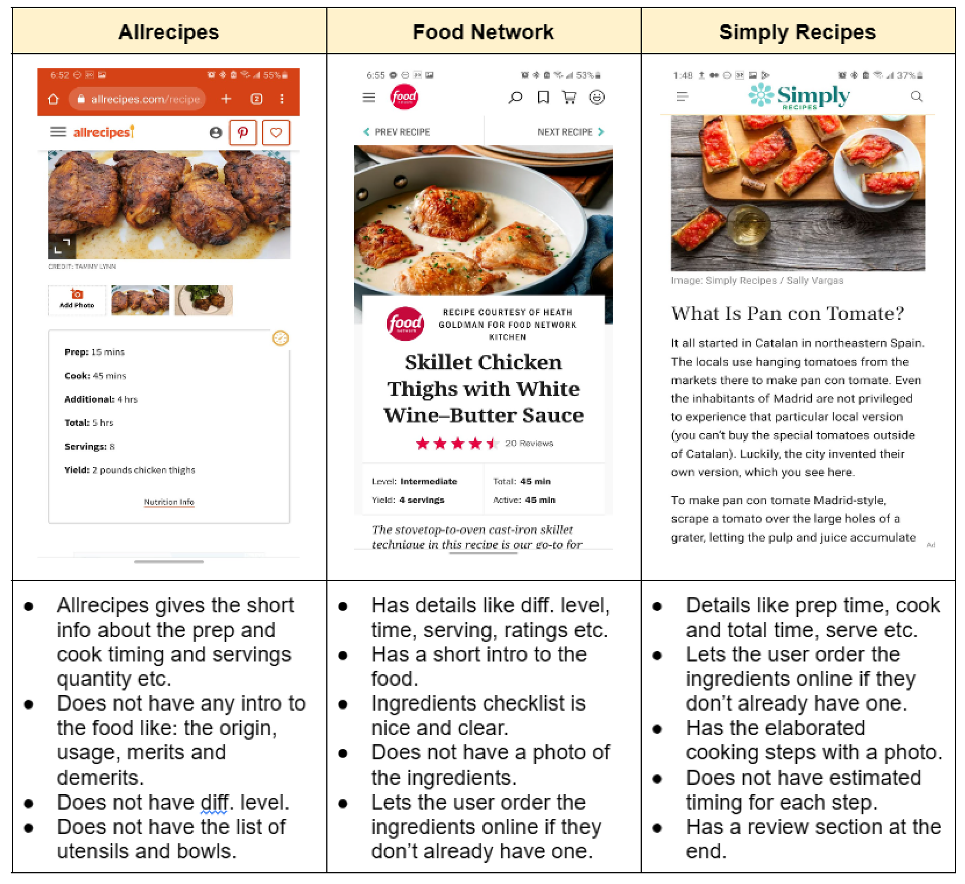
Primary Takeaways
● A good short info about the food.
● Details like serving numbers, prep time, cook time and total time.
● All inclusive ingredients and kitchenware checklist with picture
● Clear cooking steps with respective photos.
Secondary Takeaways
● Let's the user order the ingredients online if they don’t already have one.
● Nutrition facts per serving.
● Review Section at the end.
Among these good points I referred back to the User Journey I created on Day-One to be aligned to major problems and solutions.
Crazy 8s
I took advantage of the competitive research of the competitors to make a sketch with some new and borrowed ideas from them. Here’s the picture of crazy 8 sketches:
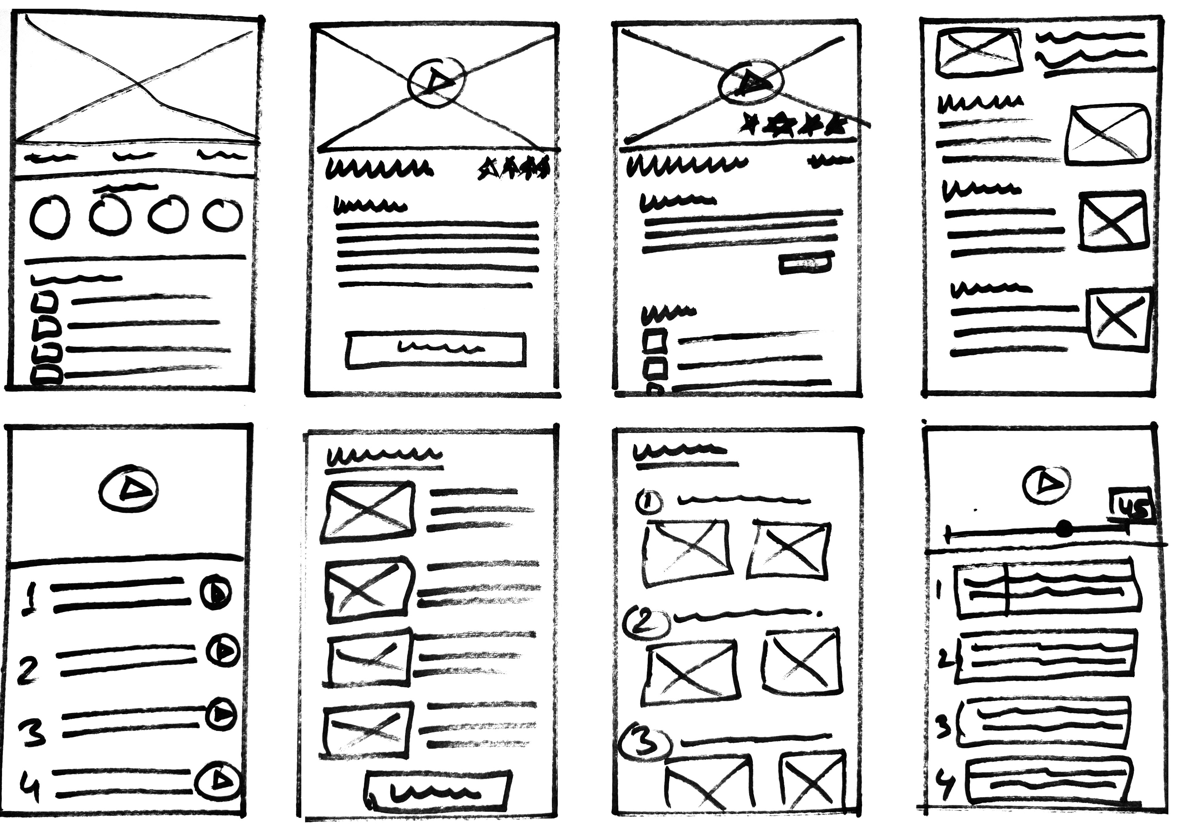
I particularly liked and enjoyed Crazy 8s Sketching since it allowed me to try out all of my ideas and automatically iterate on them in a short period of time.
Most Critical Screen
After identifying key features for this screen, I created solution sketches focused on a smooth step-by-step cooking experience. Each step includes visual media and an optional countdown timer. To support hands-free navigation, I integrated voice commands like “Next Step” and “Pause.”
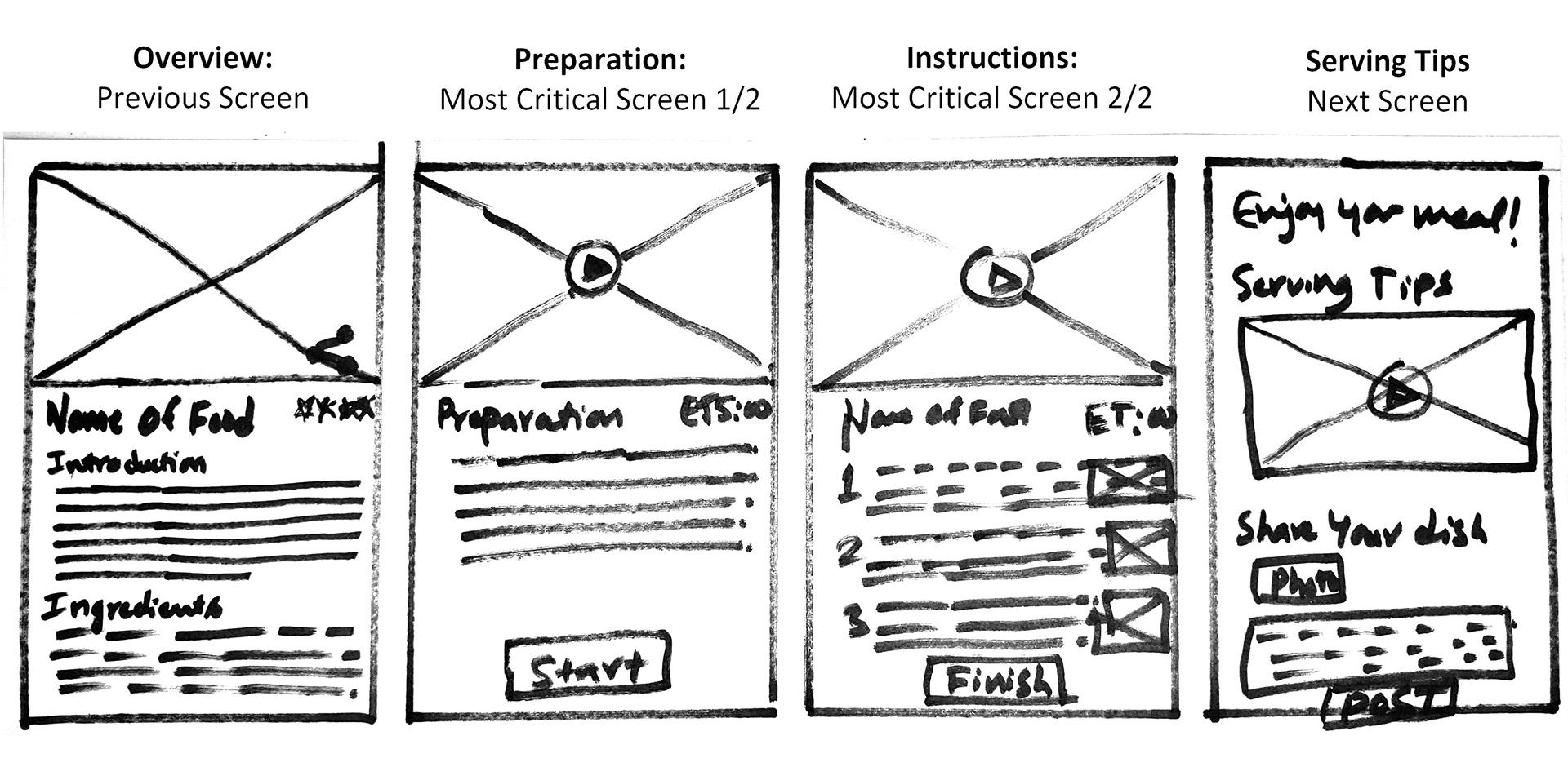
I designed four key screens—Overview, Preparation, Tutorial, and Sharing Tips & Reviews. Preparation and Tutorial were prioritized as critical for solving user pain points. I explored alternate sketches to further refine these screens and optimize usability.
DAY three
Highlights
● Re-sketched, refined the Most critical Screens.
● Decided final sketches with all UIs and basic interactions.
● Demonstrated the final sketches with notes.
● Reached out to the test participants.
Storyboard
While sketching, I explored multiple ideas but stayed focused on testing the core solution. Revisiting HMWs, user flows, and problem statements helped align each sketch with clear goals. Consolidating screens was key to enhancing speed and simplicity in the user experience.
DAY four
Highlights
● Created Wireframes
● Improved Wireframes to High Fidelity Screens
● Prototyped or wired up the screens
● Made follow up calls for Usability Tests
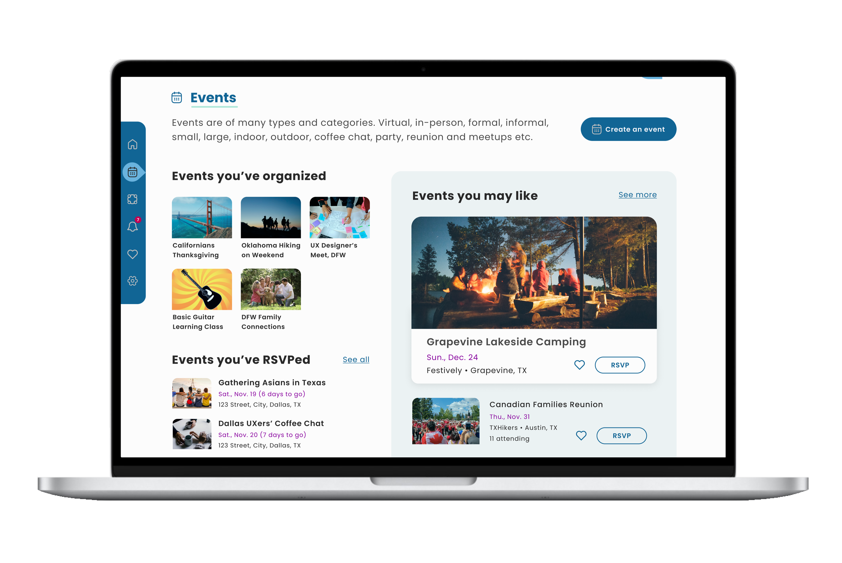
High Fidelity Screens
On Day 4 of the Design Sprint, I completed high-fidelity prototypes, prioritizing the Preparation and Instructions screens to address core user pain points.
Overview and Review screens were also added to enhance usability and deliver a smoother experience.
Visual content was inspired by competitor research, particularly Simply Recipes, to align with user expectations.
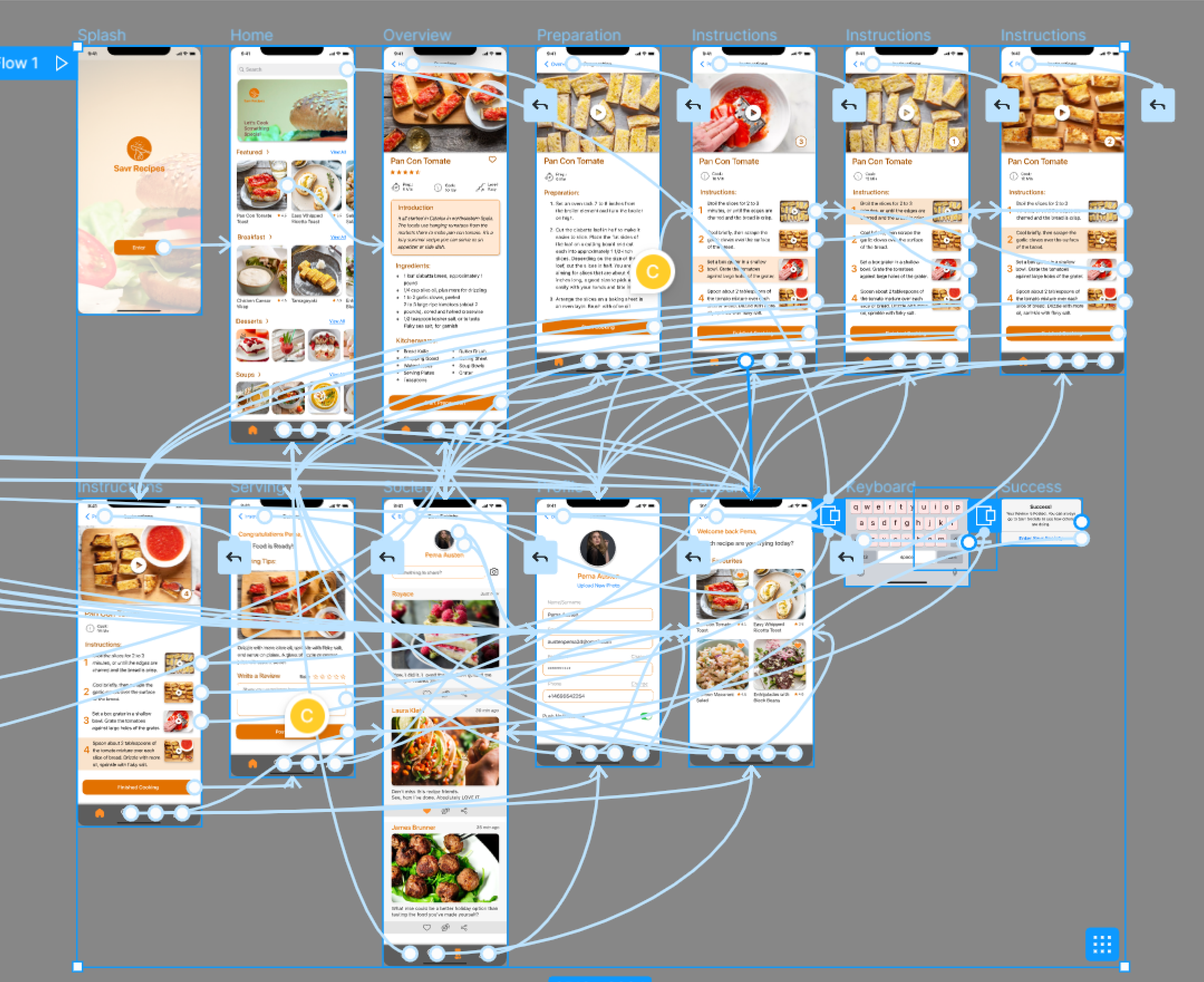
Once the Hi-fi screens were finalized, I wired up the prototypes and followed up with participants via calls and emails to begin user testing.
Wiring Up the Screens
I spent a few hours providing the details to the screens and wiring them up as well. I was trying to add a Voice Trigger feature in the prototype and very little time was remaining for Day 4. But, by the end of the day, Savr Recipe prototype was ready to be tested.
DAY five
Highlights
● Pre-test and preparation for Usability tests.
● Shared the prototypes with the participants.
● Usability Tests and Notes
● Analyzed the test notes and brainstormed for the iteration.
Usability Testing
I conducted usability testing with five local participants to see if the prototype effectively addressed the core user problems and aligned with the HMWs.
Each person completed the recipe task successfully, revealing a few minor issues that were easy to fix and helped refine the final experience.
Usability Test Findings
Critical Issues:
● Two of the participants tried to find out the option to adjust the serving. And were looking for the nutrition facts per serving too.
Solution: It is possible to make the serving count adjustable and the ingredients and kitchenwares accordingly. And, nutrition facts too.
(Est. time: 4-6 hours)
(Est. time: 4-6 hours)
● Four of them also wanted to know the approx. timing of each cooking step.
Solution: It can contribute to a better cooking experience. Can be solved easily.
(Est. time: 1 hour)
(Est. time: 1 hour)
● One of my participants had concerns with mobile data.
Solution: It can be a common user problem indeed. I should also create a data friendly ‘image only’ recipe option.
(Est. time: 5-6 hours)
(Est. time: 5-6 hours)
● One of my participants did not know what ‘Grater’ is in kitchenware. And another one expected to see the image of ‘Kosher salt’ and ‘Flaky sea salt’ in the ingredients list.
Solution: The kitchenware list and ingredients list can be made clickable resulting in popping up of the related image.
(Est. time: 4-6 hours)
(Est. time: 4-6 hours)
Prototype Issues and Minor Issues
● Three of the users tried to drag the carousels but it did not work.
Solution: The carousels can be improved.
(Est. time: 4-5 hours)
Solution: The carousels can be improved.
(Est. time: 4-5 hours)
● Two of them were trying to click on the recipe which I had not wired up.
Solution: All of the thumbnails and UIs can be made fully functional on V2.
(Est. time: 7-10 hours)
Solution: All of the thumbnails and UIs can be made fully functional on V2.
(Est. time: 7-10 hours)
● Most of the users wanted to see the recipe in the video. But the videos in the prototype were not clickable.
Solution: It would be great if the videos play in prototype. I will try if it is possible with Figma.
(Time not estimated)
Solution: It would be great if the videos play in prototype. I will try if it is possible with Figma.
(Time not estimated)
Conclusion
A 5-day Sprint offered an efficient way to identify problems and test a focused solution quickly.
Completed each day’s task while actively referencing mentors, industry examples, and best practices.
While core issues were addressed, the MVP couldn’t cover every feature—opening possibilities for future Sprints.
Lesson Learned
● Simple ideas can steal the show.
● Realized UX design works best through collaboration, not in isolation.
● Learned the major steps, theories and practices of GV Design Sprints.
Thank you for taking the time to review my case study!
If you're interested in a deeper dive into the process—research insights, reports, data visualizations, or any additional details—feel free to reach out. I'm happy to share more!