
ABOUT
The Project
It is an opportunity to apply my design knowledge to a real-world project! The app was in MVP mode. It needed more efforts to make it 'stickier' so that they can retain user interest. And our journey started to iterate the designs, gamify it and improve their existing solutions.
Team
Prakesh (Me) – UI/UX Designer
Gaojie – UI/UX Designer
Yuyin – UI/UX Designer
Rainie – UI/UX Designer
Clients
Jennifer – Founder, WeConcile
Jennifer – Founder, WeConcile
Mike – Co-Founder, Weconcile
Constraints
● It has an established logo and branding color, typography, icons and illustrations.
● Client’s approach to redesign the experience as minimum as possible.
● Time and development budget.
Roles and Responsibilities
● UX Research & Analysis
● Sketch
● Wireframes & Prototyping
● Hi-fi Screens
● Usability Testing
Tools Used
Figma, FigJam, Emails,
Slack, Google Docs,
Google Drive &
Accessibility Checker etc.
Problem
● Users are finding it difficult to navigate to the lessons and courses.
● People are not able to track their learning process.
● The app lacks the success messages, encouragements and a bit of gamification.
● Needs enhancement in the app's UI design
Solution
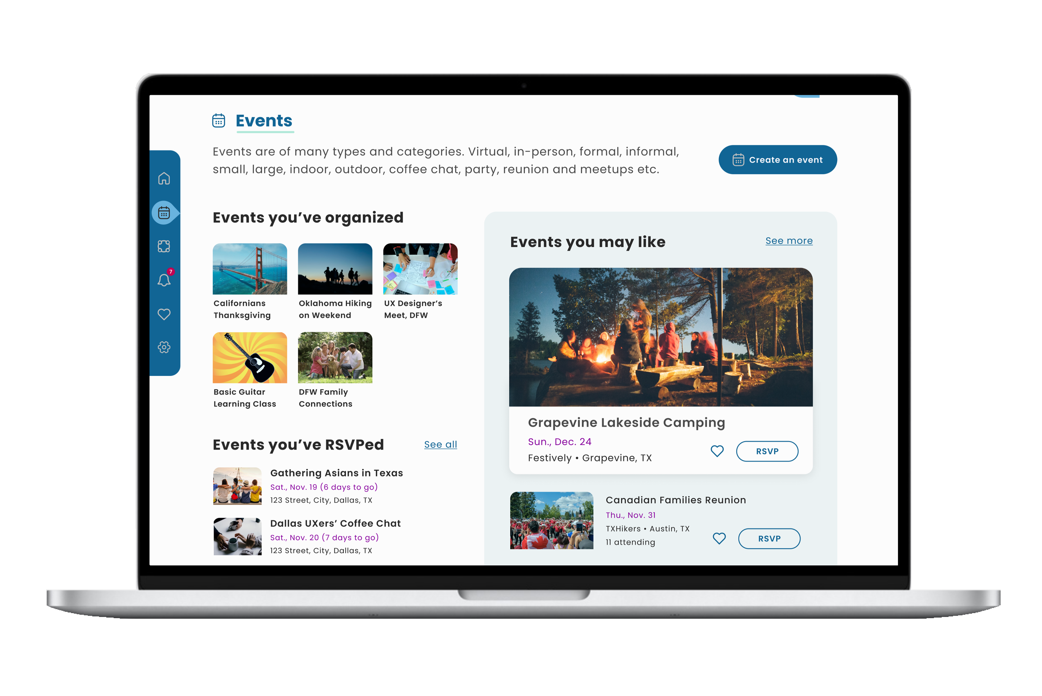
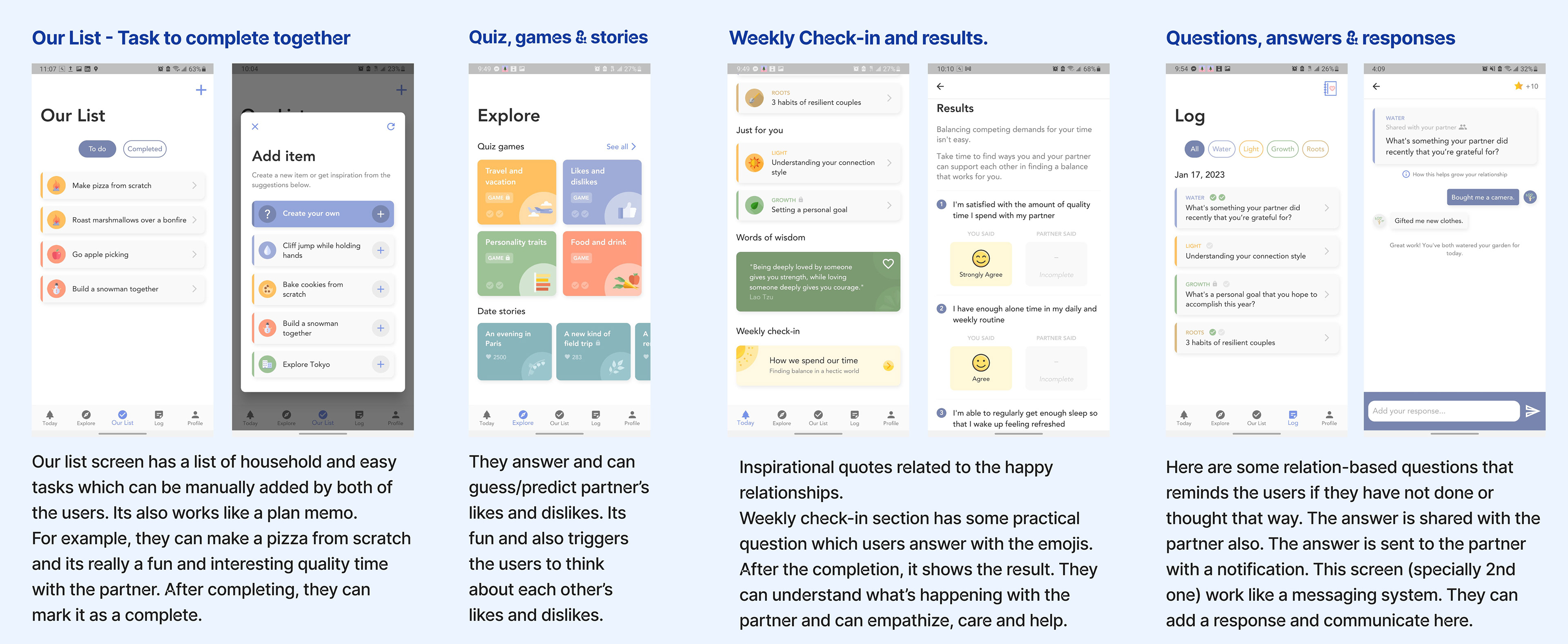
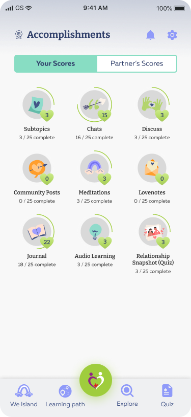
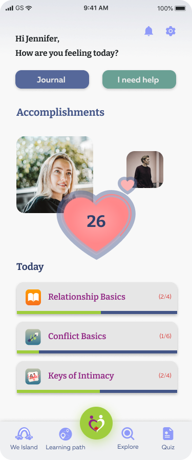
● Redesigned Home, Explore, Learning Path, We Island, Accomplishments, and onboarding screens for easier navigation.
● Reorganized lessons into Courses, Audio Learning, and Meditation.
● Grouped Discuss Learning, Let’s Talk, and Love Notes under We Island.
● Added gamification with a progress dashboard, success texts, and Accomplishments.
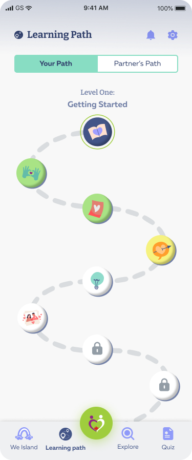
● Introduced Learning Path to track user and partner progress.
DISCOVER
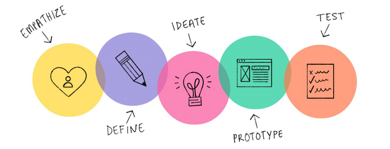
Design Thinking
I (we) adopted an agile design thinking process for the development of the product. It allowed me (us) to do additional research while iterating the designs and redesigning it.
UI/UX Deliverables:
● User Personas ● Empathy Map
● Scondary Research ● Affinity Map
● Informational Architecture ● HMWs
● Competitive Analysis ● Sketches
● Prototypes ● Hi-fi Screens
Primary research
Competitive Analysis and Takeaways
Our team studied competitors, and I analyzed Evergreen and Between. This research helped improve lesson organization, navigation, and gamification for WeConcile, making the app more engaging and user-friendly.
Analyzed Current Informational Architecture
● The home screen had too many buttons and icons, making navigation confusing.
● Users struggled to find where to start or continue learning.
● Three similar communication tabs—WeIsland, Discuss, and Partner Chat
Proposed Informational Architecture
After depicting the current informational architecture, we analyzed the tabs, buttons, options and sub tabs and prioritized the important contents and reorganized the categories.
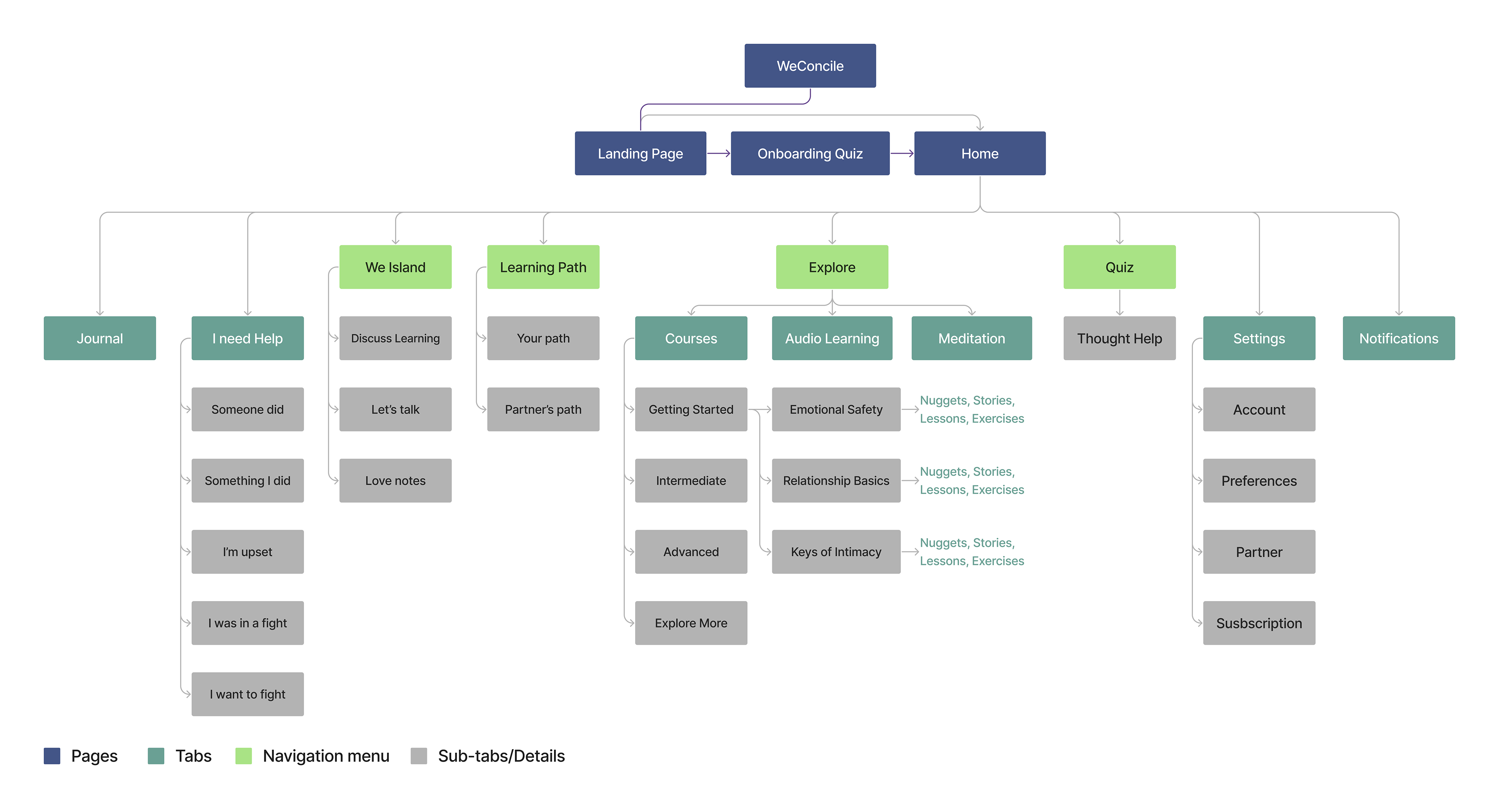
Major Changes in Information Architecture
● Four key items added to bottom navigation: We Island, Learning Path, Explore, Quiz.
● Grouped Discuss and Partner Chat under We Island.
● Renamed them: Discuss Learning, Let’s Talk, Love Notes.
● Categorized lessons into Courses, Audio Learning, Meditation.
● Courses arranged logically: Getting Started, Intermediate, Advanced, Explore More.
● Learning Path tracks progress for both user and partner.
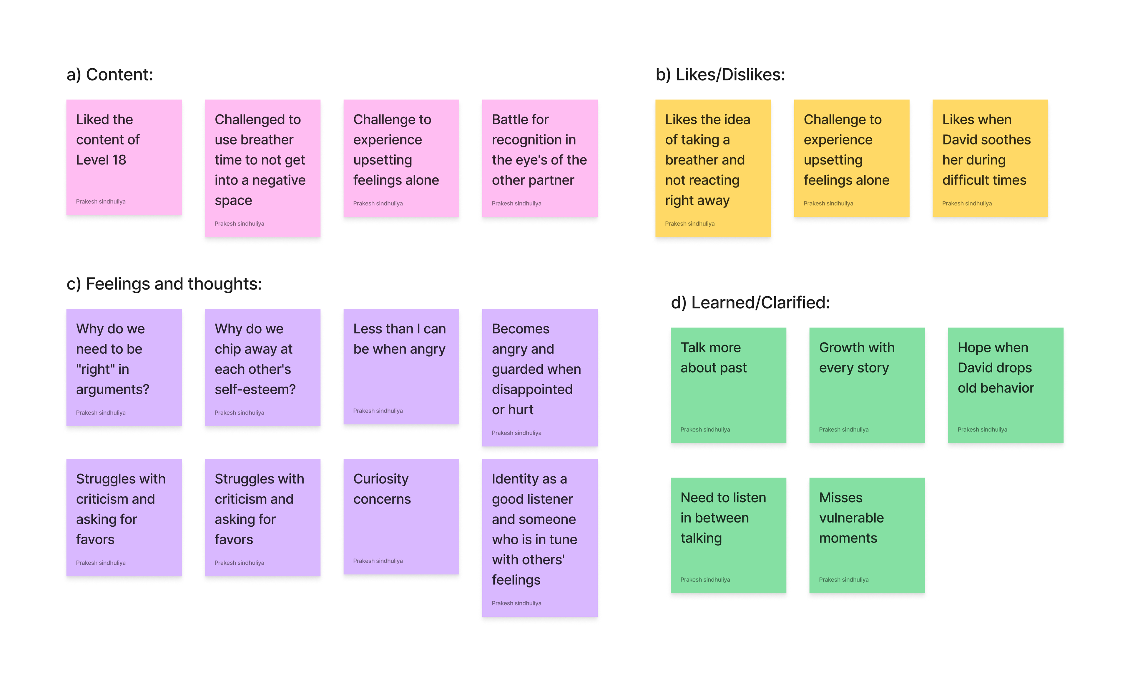
Affinity Mapping
I executed user feedback and implemented various Research Synthesizing methods. It greatly aided me in empathizing and classifying their practices, pain points, likes and dislikes
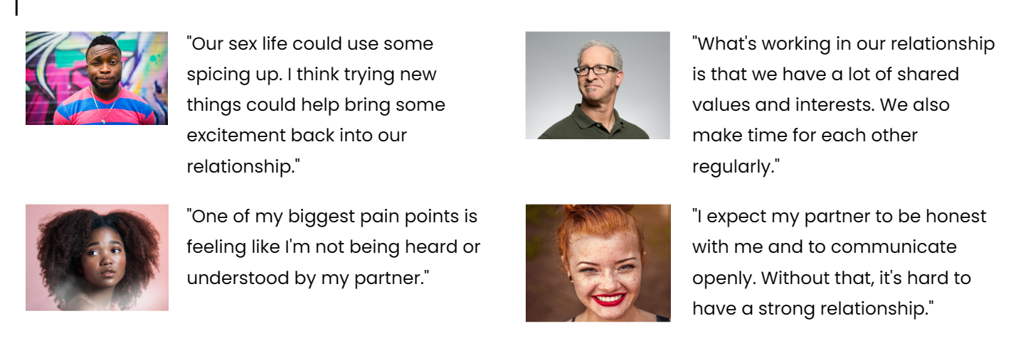
Secondary Research
I conducted a secondary research over the internet and blogs regarding what people think, do and expect in their relationships, and their pain points as well.
Ideation
● Aligning with the industry practices for easy navigation.
● Show progress and keep learning.
● ‘Explore’ icon for quick lesson access.
● ‘Learning Path’ tracks user progress.
● Organize lessons into clear categories.
● Display points and achievements earned.
● Chat room for support and love notes.
DISCOVERY
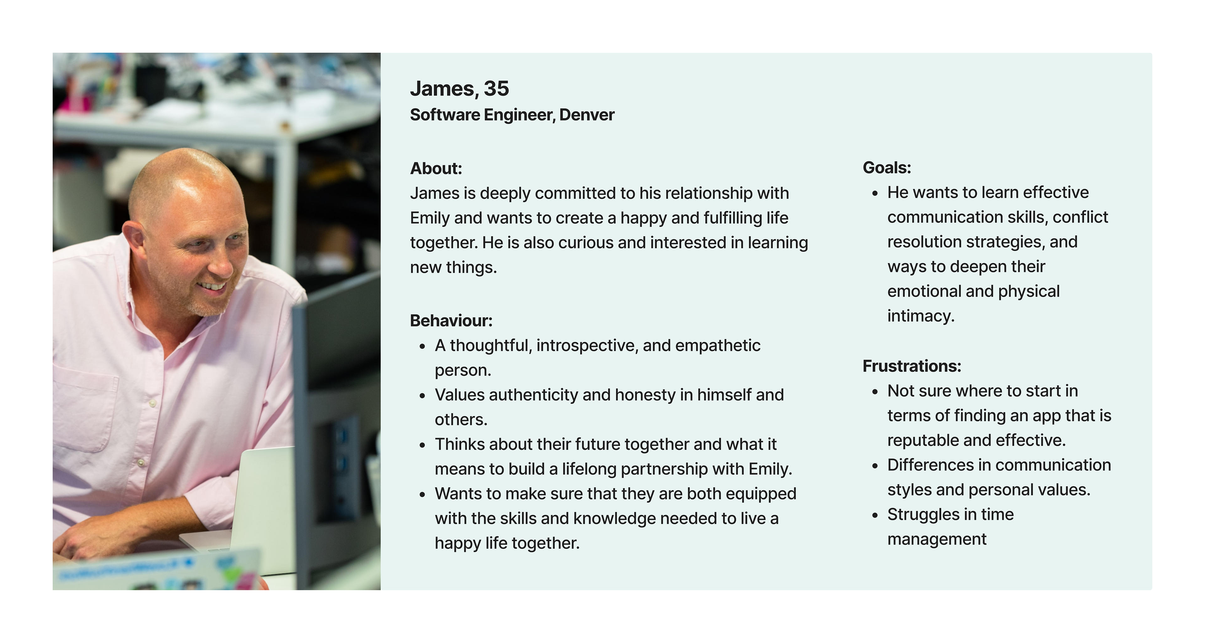
User Personas
User Personas
Empathy Map
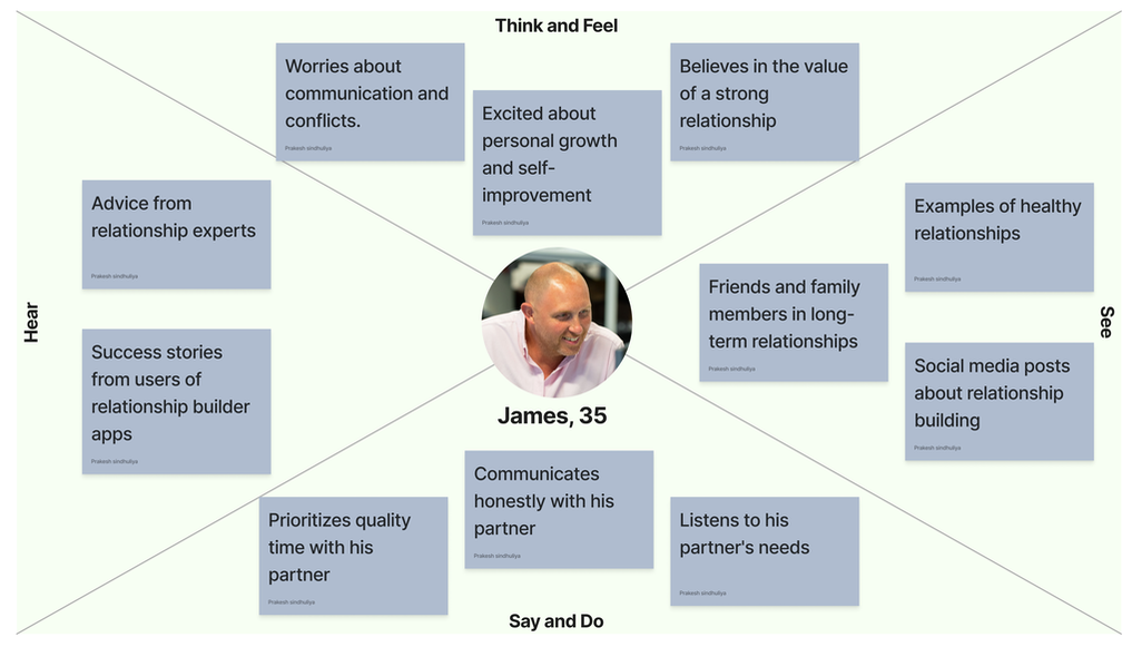
As expected, Empathy maps helped me to empathize with potential users’ mentality, pains and gains which helped me ideate and re-ideate better.
Style Guides
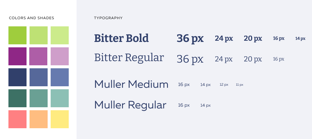
The Colors and fonts were already established in the existing app. We could not change but use the colors and its shades and the fonts and sizes specified to match the rest of the screens.

EXECUTION
Onboarding Screens Redesign Sketch to Hi-fi
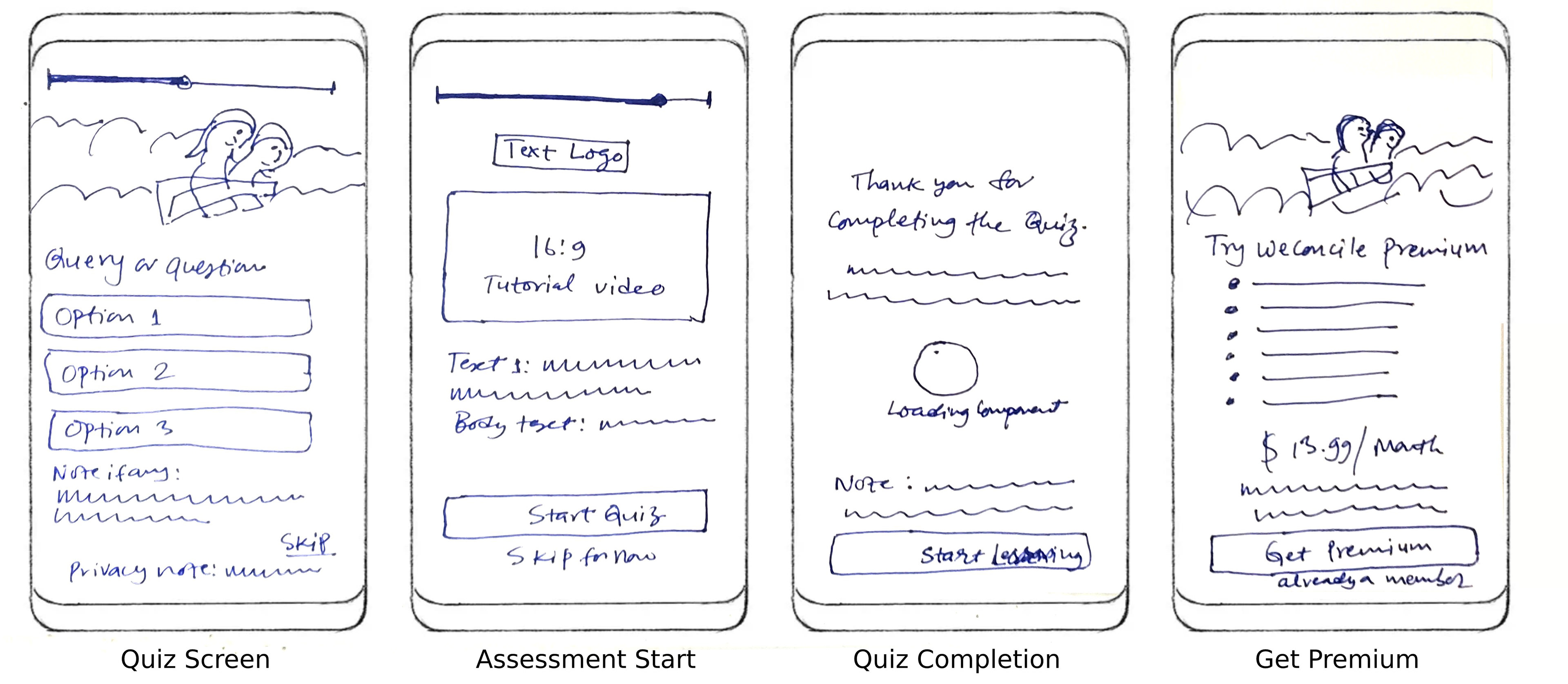
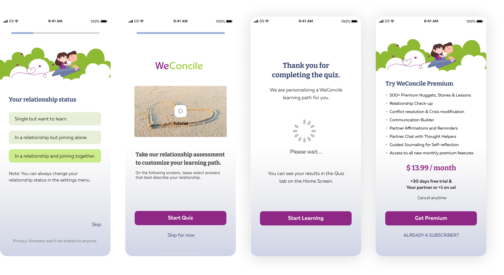
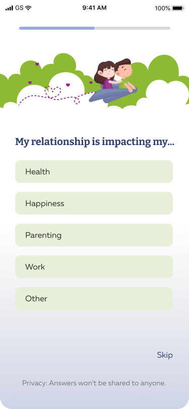
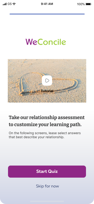
● Onboarding screens converted to a survey quiz.
● Suggested moving it to Assessment Screen.
● Checked color contrast for better readability.
● Added encouragement and thank-you message.
● Improved scrolling subscription layout.
Crazy 8s
Taking inspiration from competitors and aligning with the problem statements, I started with crazy 8s for a quicker solution.
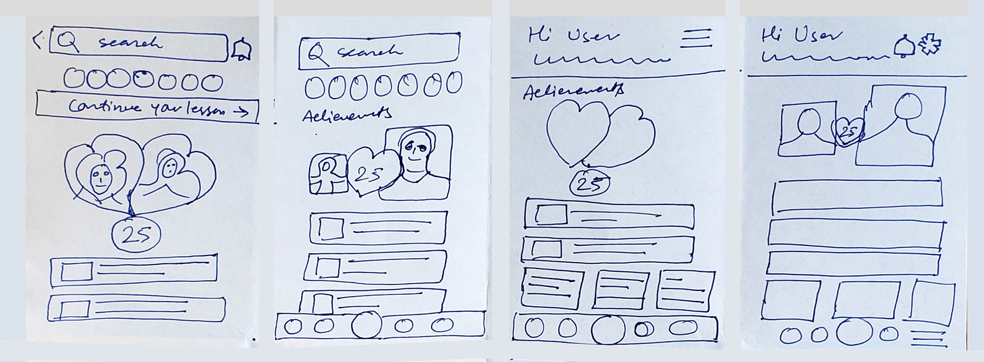
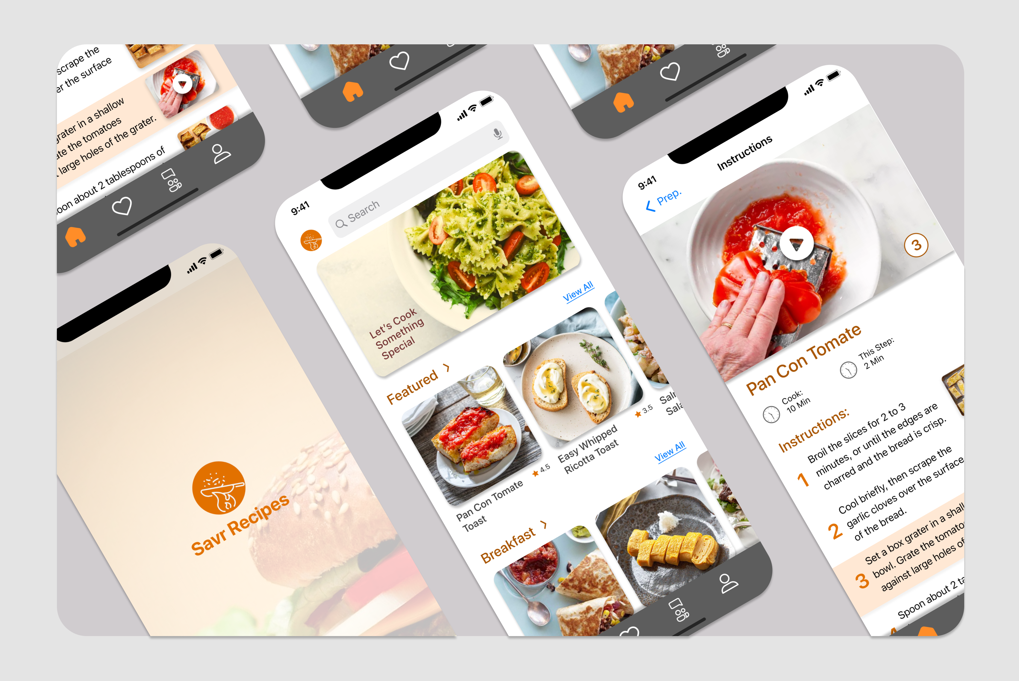
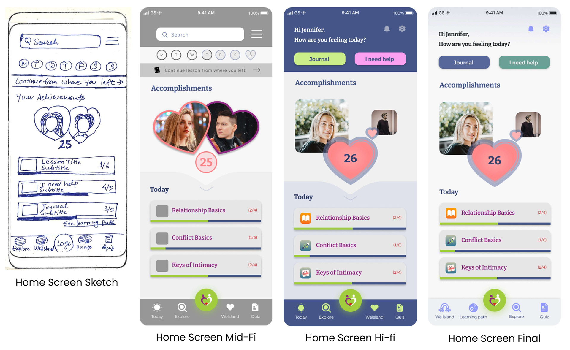
Sketch to the Hi-fi (Home Screen)
Here’s an example of the journey from sketch to mid-fidelity to high-fidelity of our Home Screen:
Sketches (Explore, Accomplishments & Learning Path)
To start with a sketch, I took inspiration from the listed competitors: Between, Evergreen and other unlisted gamifying apps like Candy Crush Saga and Duolingo.

High Fidelity (Explore, Accomplishments and Learning Path)

FINAL HI-FI SCREENS
Each UX Designer focused on different screens, contributing to a fully collaborative team effort. These are the high-fidelity screens I designed and implemented for WeConcile.

After multiple meetings to test, retest and align with the current WeConcile standard and created a team file with annotations and handed it over to the developers.
LESSON LEARNED
● Understanding of User and Business Needs.
● Teamwork and Collaboration
● Time Management
● Adaptability
● Teamwork and Collaboration
● Time Management
● Adaptability
Thank you for taking the time to review my case study!
If you're interested in a deeper dive into the process—research insights, reports, data visualizations, or any additional details—feel free to reach out. I'm happy to share more!